Your website is most likely the hub of every other marketing asset. Before people pick up a phone, write an email, or make a purchase, they will visit your website. Here’s a tip: don’t treat your website like “just another piece of marketing collateral.” It’s not.
A bad user experience = bad brand impression. Bad messaging = bad brand impression. Bad imagery = bad brand impression. I think you get it. If your website, especially your homepage, is not created with the proper goal of telling people what you do, how you will make their lives better, and how they can engage with you, then you’re losing sales.
By being unclear or uninformative or even just by looking cheaply made, your potential customer will get the message that, “we are an unclear, unhelpful, and a cheap business.” Because the online world has taken over, the buck stops with your website. No one will spend 20 minutes trying to decode your poorly written descriptions, and nobody will pick up the phone and call you for clarification. They will conclude that your company isn’t up to date and is therefore irrelevant, and they will find someone else.
Learning the basics about the psychology of your customer and website formatting is enough to transform your website into your #1 salesman and brand advocate.
One important thing to consider when it comes to your website messaging is the five-second rule. This rule is based on two things: 1) that your customer’s time is valuable 2) that your customer’s mental energy is valuable. Your brain has limited capacity. It will take in what it needs to thrive and survive and discard the rest. If your brain thinks there is needless information or is spending too much time and energy trying to decode pointless information, it will turn off and preserve remaining energy. As busy people who have a lot of choice in the current marketplace, there’s no denying that most of us will abandon a potential purchase if it isn’t convenient. As the marketer, it is your job to make the purchase as convenient as possible.
5 Seconds
How do you know if your website messaging passes the five-second rule? The best thing to do is to ask. Next time you’re with someone who isn’t familiar with your business, ask them to look at your homepage for five seconds and get their feedback. Another super simple FREE (for the basic level) tool is fivesecondtest.com. It will pick a random set of individuals, get their feedback, and provide you with that report.
There are general homepage “best practices” you can implement. Think about that main message – that big, bold, short statement that tells people what they need to know and feel. The trick here is also to try and NOT use the word “we.” The statement should usually be about your customer’s problem and how you solve it. I’m not banning “we” altogether, but give it a whirl and see what happens.
Some Examples? OK.
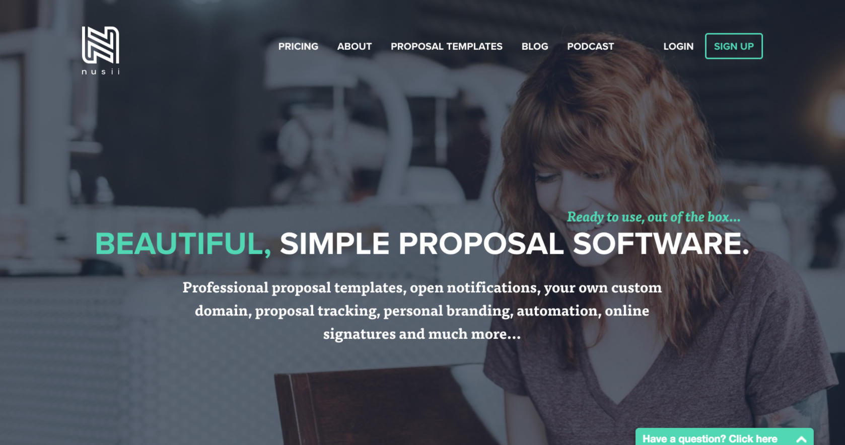
Nusii is an online proposal platform allowing for users to create “beautiful, simple proposals.” They target creative agencies who don’t only care about quickly creating proposals, but also care about what they look like.

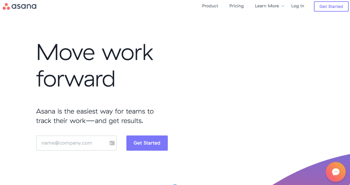
Asana is a task management/team collaboration tool. What’s the goal? To keep everything moving forward. Productivity!

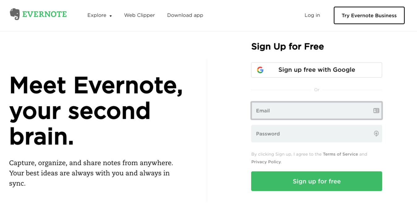
Evernote grabs you with a quick, quirky headline, then lays out what they are and how it benefits you.

Let us finish
Strategizing about how to drive leads to your website should be the first task of any digital marketing campaign. Once they are there, what is the goal? What is the first message you are sending them? There is not a one-size-fits-all solution, but we’ve found that starting simple works. You can always build upon what you’ve done, and better yet, test things out! Make sure you’re monitoring where people are clicking on the homepage if they are even scrolling down to see more information, and what their other on-site behaviors are.
The 5-second rule is something we use at the beginning to help build the foundation. We start there because it helps us get rid of the “noise” that people use in their messaging and design. It helps us simplify. At the end of the day, when a visitor views your homepage, can they easily find out:
- What you do,
- How you can make their life better, and
- How to get in touch with you?
–––––
How healthy is your brand? Take this free 20-question survey to find out.

